Media Hero
A MediaHero displays an image or video with optional text, buttons and links positioned as an overlay.
Example
- Preview
- Code
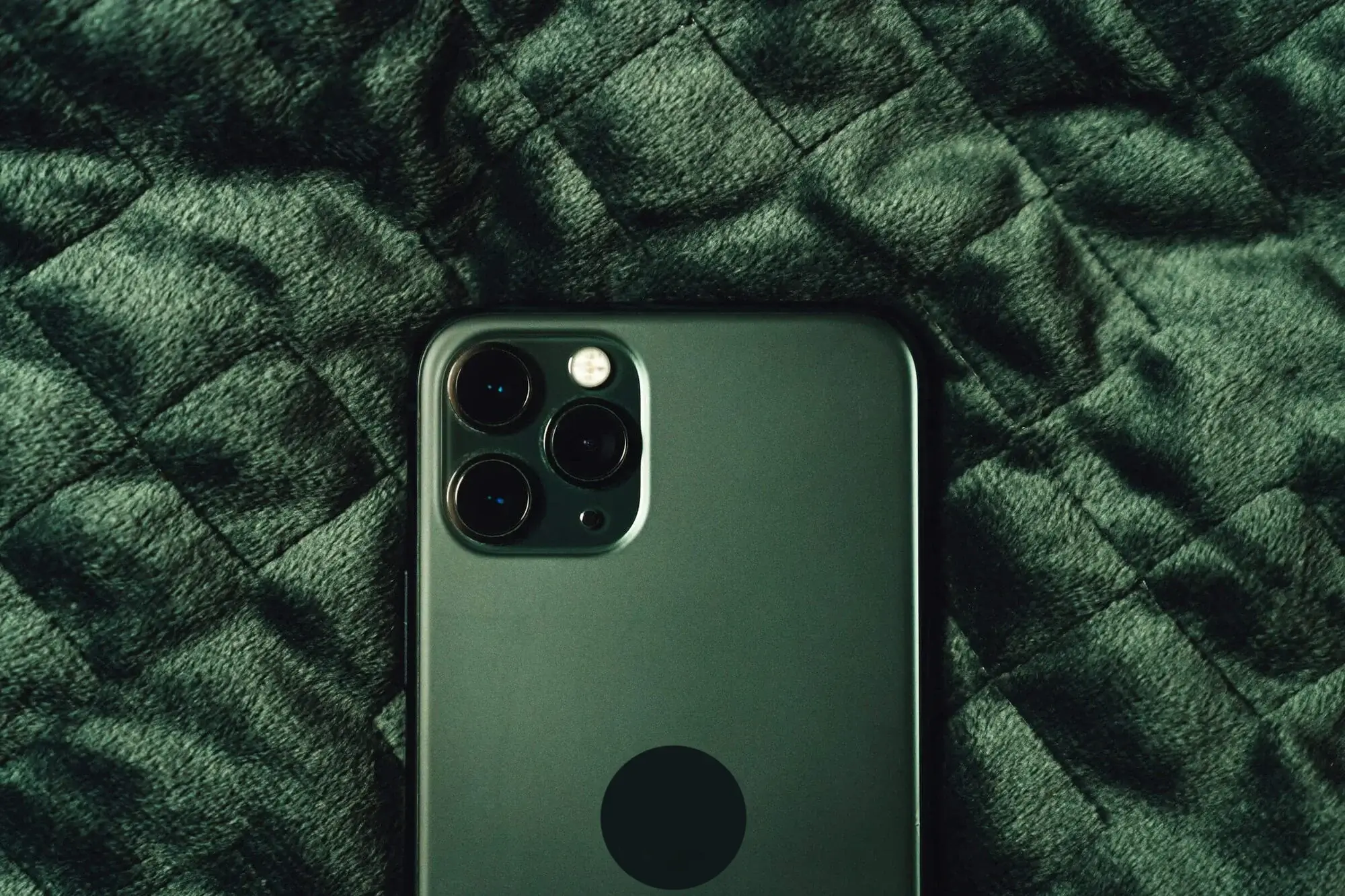
New
Phone
Our most powerful cameras yet. Ultrafast chips. And USB-C.
tip
If using this component in a NextJS app, replace the <img/> element used in this code example with the NextJS Image component.
import { mockMediaHero } from '@hv/mock/cms';
import { Button } from '@hv/ui/button';
import {
  MediaHero,
  MediaHeroBackground,
  MediaHeroCTAs,
  MediaHeroContent,
  MediaHeroEyebrow,
  MediaHeroHeader,
  MediaHeroLinks,
  MediaHeroSubcopy,
  MediaHeroTextBlock,
} from '@hv/ui/hero';

export default function MediaHeroExample({
  textBlockPosition,
  ctas,
  links,
  ...variants
}) {
  return (
    <MediaHero {...variants}>
      <MediaHeroBackground>
        {mockMediaHero.media?.type === 'image' && (
          <img src={`/img/${mockMediaHero.media.src}`} alt='Mock Media Hero' />
        )}
      </MediaHeroBackground>
      <MediaHeroContent>
        <MediaHeroTextBlock position={textBlockPosition}>
          <MediaHeroEyebrow {...mockMediaHero?.eyebrowText} />
          <MediaHeroHeader {...mockMediaHero?.header} />
          <MediaHeroSubcopy {...mockMediaHero?.subcopy} />
        </MediaHeroTextBlock>
        <MediaHeroCTAs {...ctas}>
          {mockMediaHero?.ctas?.map((cta, idx) => (
            <Button key={idx} variant={cta.variant}>
              {cta.label}
            </Button>
          ))}
        </MediaHeroCTAs>
        <MediaHeroLinks {...links}>
          {mockMediaHero?.links?.map((link, idx) => (
            <Button key={idx} variant='link'>
              {link.label}
            </Button>
          ))}
        </MediaHeroLinks>
      </MediaHeroContent>
    </MediaHero>
  );
}
Variants
Use theicon above to preview
| Variant | Description | Values |
|---|---|---|
MediaHero.desktopOrientation |
| |
MediaHero.mobileOrientation |
| |
MediaHero.paddingTop |
| |
MediaHero.paddingBottom |
| |
MediaHero.height |
| |
MediaHeroTextBlock.position |
| |
MediaHeroCTAs.direction |
| |
MediaHeroLinks.direction |
|
Customization
Approach for customization will vary depending on if the customization is intended to be global for all consumers of the ui component or if it is only an override for a particular instance.
- If the customization is necessary for all users, update the source code of in the ui component library directly.
- Otherwise, you can pass
classNameoverrides.
Say you wanted to make the eyebrow text italic for one particular use case:
<MediaHero>
  ...
  <MediaHeroContent>
    <MediaHeroTextBlock>
      <MediaHeroEyebrow className='italic'>Eyebrow Text</MediaHeroEyebrow>
      <MediaHeroHeader>HeaderText</MediaHeroHeader>
      <MediaHeroSubcopy>Subcopy</MediaHeroSubcopy>
    </MediaHeroTextBlock>
  </MediaHeroContent>
</MediaHero>