Image Optimization
Optimizing raw images before using them in your High Velocity front-end application is crucial for performance, especially as images can be a significant part of the page's load time. This guide will walk you through how to size and optimize images for your app effectively.
Why Image Optimization Matters
Optimizing raw images before using them in your High Velocity front-end app is essential for a number of reasons:
- Improved Performance: Large image files slow down page load times, leading to higher bounce rates and poorer user experience.
- SEO Benefits: Search engines like Google reward fast-loading websites, which can improve your rankings.
- Mobile Users: Images that are too large will negatively affect mobile data usage and render slowly, especially on slower network connections.
- Better User Experience: Faster load times mean happier users, and faster image loading can improve user engagement and reduce page abandonment.
In the High Velocity front-end app, we do a lot of the work for you by leveraging Next.js automatic image optimization tools to handle image sizes and quality more effectively. We apply best practices such as configuring image sizes so the right image is served to the right device, lazy loading images, and setting the image file format.
In the guide below, we'll provide tips and best practices that you can follow to ensure your raw images are optimized for use in the app's components.
Best Practices for Image Optimization
Because we already cover image best practices in code, you only need to be concerned with:
- Use the Correct Dimensions: Only use image dimensions that match or are slightly larger than the size they’ll be displayed at. Avoid using oversized images.
- Compress Images: Compressing images without losing visible quality helps reduce their file sizes significantly.
Manual Image Optimization Techniques
A. Resizing Images
-
Use an Image Editor: Tools like Photoshop, Affinity Photo, or GIMP allow you to resize your images manually to fit the intended size on your web page. Ensure the dimensions match the largest display size of the image in your app. For example, if an image will be displayed at 1200px width, upload it at 1200px width rather than 4000px width.
-
Online Resizing Tools: If you don’t have access to an image editor, you can use free online tools like Pixlr or ResizeImage.net to resize images.
B. Compression Without Losing Quality
-
Lossless Compression: This method compresses images without losing any quality. Tools like ImageOptim (for macOS), OptiPNG, or JPEGoptim can be used for lossless compression.
-
Lossy Compression: This method reduces file size by discarding some image data, which may affect quality but often results in smaller file sizes. Tools like TinyPNG, JPEGmini, or Squoosh are excellent for this type of compression.
Recommended Image Dimensions
When optimizing images for web display, the key is finding a balance between visual quality and file size (page weight). Images that are too large can slow down your site, while images that are too small can appear pixelated or blurry. On standard monitors, 72-96 PPI (Pixels per Inch) is common, but on Retina displays, images need to be delivered at 2x or 3x the resolution to look sharp.
The recommendations below are for Retina displays (like on many smartphones, tablets, and laptops). To ensure images appear crisp on high-PPI displays, they should be at 2x or 3x the size they are displayed on the screen.
For example, if an image is displayed at 600px × 400px on a standard display, you should upload the image at 1200px x 800px for 2x displays. The built-in image optimization will ensure the correct sized image is delivered to the device in use.
High-PPI images tend to be larger, but it's important to compress them efficiently to keep the file size manageable (e.g., 100KB - 500KB for typical images).
Recommended PPI and Resolution for Common Web Images
| Image Type | Resolution for Standard Display | Resolution for 2x Retina Display | Recommended PPI |
|---|---|---|---|
| Product Image | 600px - 1200px (width) | 1200px - 2400px (width) | 72 - 96 PPI |
| Hero Image (Banner) | 1200px - 1920px (width) | 2400px - 3840px (width) | 72 - 96 PPI |
| Content Image | 600px - 1200px (width) | 1200px - 2400px (width) | 72 - 96 PPI |
| Thumbnail | 400px - 600px (width) | 800px - 1200px (width) | 72 - 96 PPI |
| Logo/Icon | 300px - 500px (width) | 600px - 1000px (width) | 72 - 96 PPI |
High Resolution Dimensions by High Velocity Component (2x)
- Product Image:
- Square aspect ratio
- Intended for use in product pages and components
- Fills the entire media container; can cause some cropping if not square
- Recommended resolution: 2000px x 2000px
- Media Card:
- Square aspect ratio in default height
- Responsive image set to a fixed height when set to 'Icon', 'Banner', or 'Hero' heights
- Intended for use in grids or carousels, not as a full-screen component
- Fills the entire media card container; can cause some cropping
- Recommended resolutions:
- Default: 2000px x 2000px
- Icon (150px): 600px x 300px
- Banner (300px): 1280px x 600px
- Hero (600px): 1280px x 1200px
- Media Hero:
- Intended as a full-screen component
- Responsive image set to a fixed height
- Fills the entire container; will cause cropping between viewports
- Recommended resolutions:
- Default (400px): 3840px x 800px
- Banner (300px): 3840px x 600px
- Hero (600px): 3840px x 1200px
- Media Block Hero:
- Intended as a full-screen component; the media takes up half.
- Responsive image set to a fixed height
- Fills the entire container; will cause cropping between viewports
- Recommended resolutions:
- Default (400px): 1920px x 800px
- Banner (300px): 1920px x 600px
- Hero (700px): 1920px x 1400px
Go desktop first when it comes to images. In full-screen components, the same image will be rendered as a 1920px x 400px desktop image and a 430px x 400px mobile image. In other words, what is landscape in desktop, becomes portrait in mobile. Ensure your responsive image doesn't have unwanted cropping in large viewports by using an image with desktop dimensions.
Media Hero Crop Example
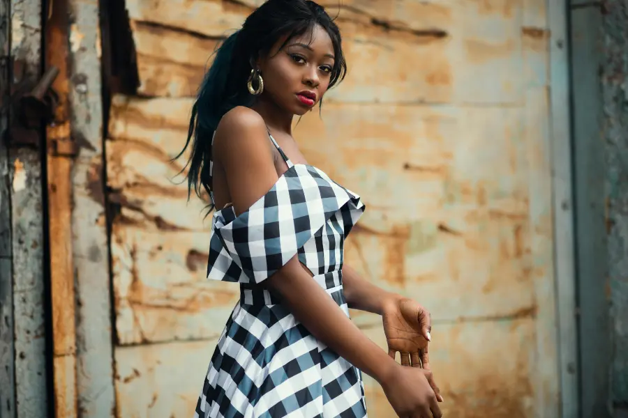
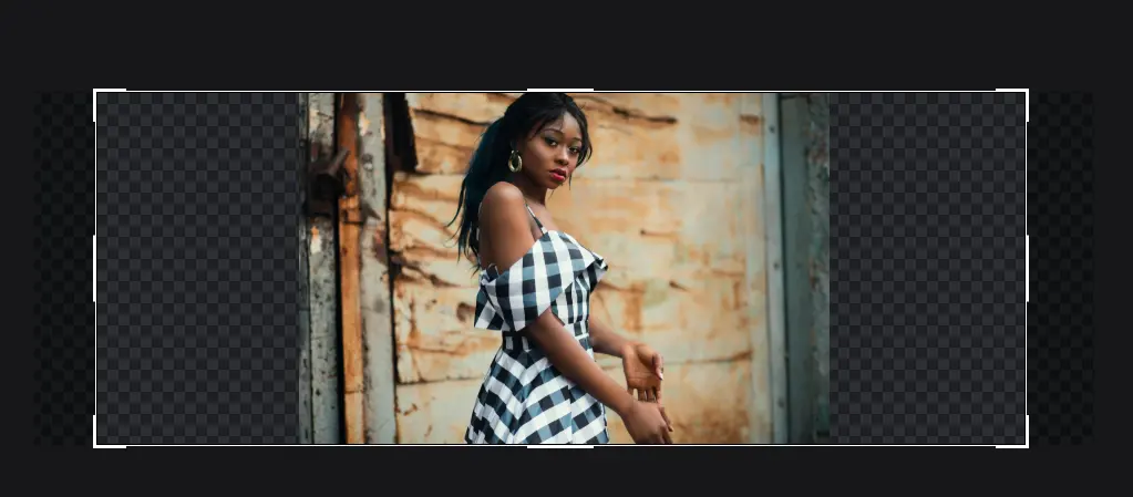
To help understand why we recommend desktop-first cropping, take the example of the image below. The original image is close to a 3:2 aspect ratio, meaning it is just a bit wider than it is tall. If we use this image as-is in the Media Hero component, what looks great in mobile will be unrecognizable in desktop. This is because desktop requires a much wider image.
Original Image:

Image used as-is in the Media Hero mobile:

Image used as-is in the Media Hero desktop:

Visual of additional width required for proper desktop rendering:
